ABout the Client
original logomark
Nerdy Diva is a Black woman-owned tech company specializing in transforming visions into reality through expertly crafted training, innovative UX design for websites and apps, impactful instructional design materials, and dynamic e-learning solutions.
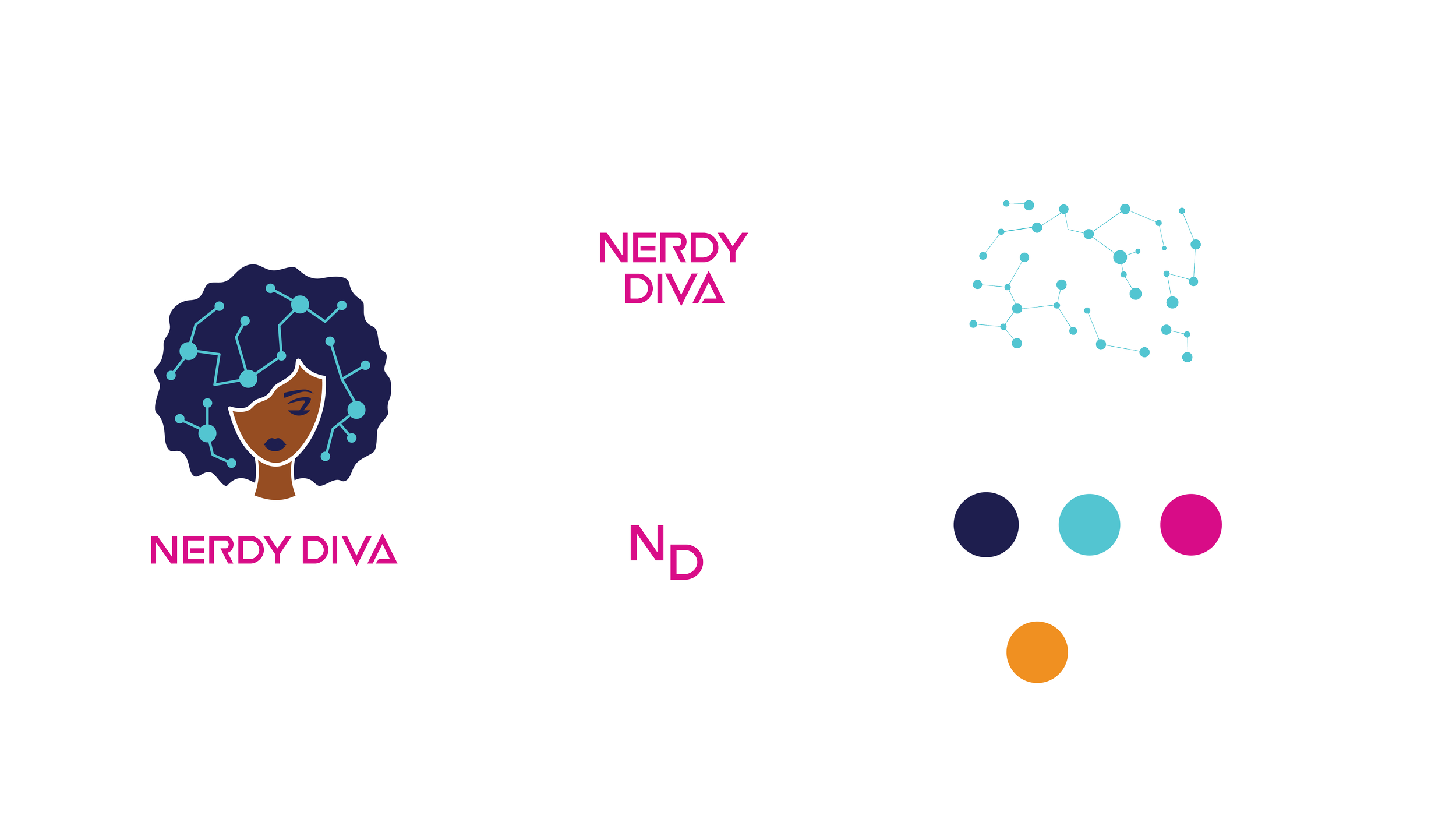
The reconstructed logo’s features reference several key features about the brand, including the company's origins as a Black woman-owned business, its multicultural audience of clientele and team members, and its position as a leading competitor in the corporate UX design market.
“The new mark should be innovative, approachable, and savvy”
OBJECtive
The primary objective for the project was to create a new logo that references several key features about the brand, including the company's origins as a Black woman-owned business, its multicultural audience of clientele and team members, and its position as a leading competitor in the corporate UX design market.

MOODBOARD
The discovery stage of the logo development process identified values, attributes, and visual signifiers that define the brand today. Seeking inspiration from existing media and brands helped inspire a refreshed logo design that is true to the brand's personality.
DEVELOPMENT STAGES

LOGO Anatomy
Blending visual elements that reference symbols of the tech industry and the company founder’s own cultural identity helped to create an authentic and uniquely representative logomark.
BRAND ELEMENTS

APPLICATIONS
Ready for your brand transformation?
Book your project today!


